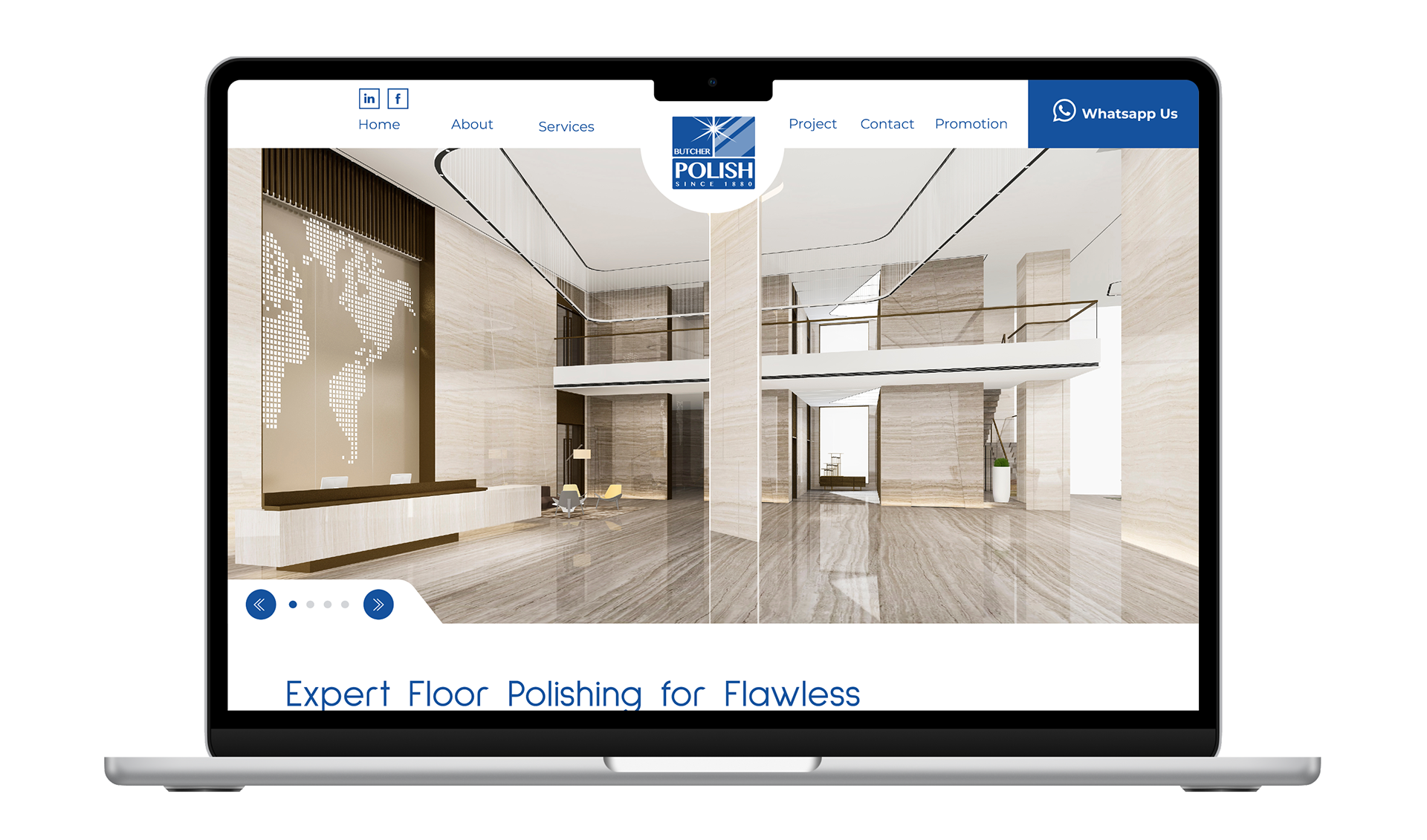
Butcher Polish, established 1880, is a legacy brand in commercial floor care. Renowned for high-performance finishes, cleaners, and sealers, it delivers superior shine, protection, and cleanliness for industrial floors. The brand embodies durability, efficacy, and aesthetic excellence through innovative, long-lasting solutions for demanding environments.
The Brief/Challenge:
To revitalize the visual identity of Butcher Polish, bridging its rich 1880 heritage with 21st-century modern minimalism. The goal is to create a premium, industrial-grade logo that visually communicates the brand's enduring promise of superior shine, durability, and commercial-grade floor protection while maintaining global brand recognition.
Current Challenge:
The current visual identity anchored by a complex, gradient-heavy split-block design, feels outdated and lacks digital scalability. It fails to effectively translate the brand's legacy across modern touchpoints, from embroidered uniforms to digital screens, without losing its authentic 19th-century roots. The new design needs to simplify the signature "starburst" and "reflection" elements to ensure the brand looks engineered for the future while remaining unmistakably Butcher.
Role & Deliverables:
Role:
Lead Graphic Designer.
Lead Graphic Designer.
Deliverables:
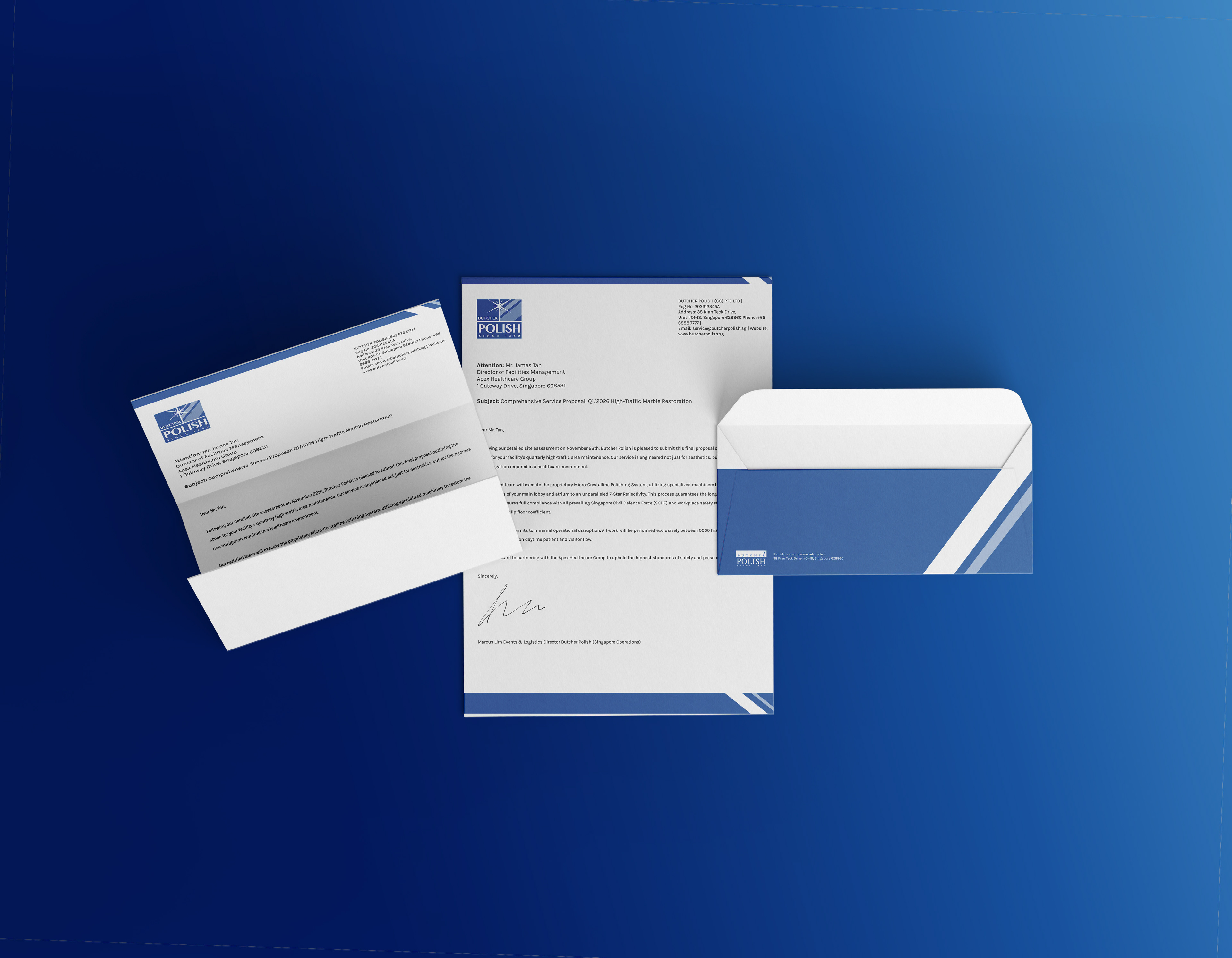
Primary & Secondary Logo Suite (Vertical/Horizontal), Brand Guidelines (Typography & Color), Industrial Application Mockups (Chemical Jugs, Floor Machines, Staff Uniforms) and Website.
Project Duration/Year:
6 weeks, 2025
The Target Audience Analysis
The Compliance Guardian
(Focus: Risk Mitigation & Reliability)Demographics
(Focus: Risk Mitigation & Reliability)Demographics
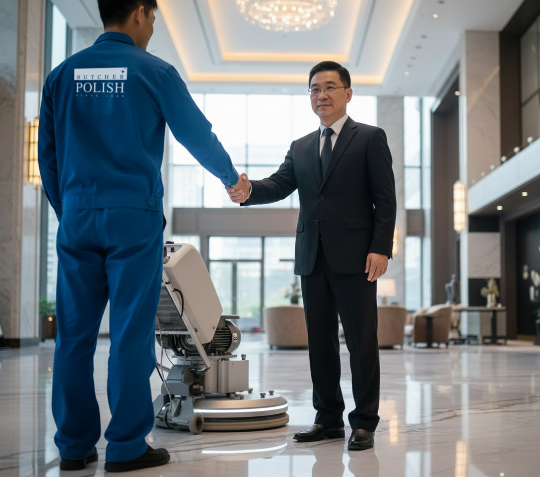
James Tan is a 52-year-old Director of Facilities for a major Singapore Healthcare Group, overseeing multiple hospitals and specialist centers.
Motivations
James is driven by strict adherence to health and safety protocols. His primary goal is to secure a service partner who guarantees regulatory compliance, ensuring that floor hygiene and slip-resistance standards are met without exception. He prefers long-term, fixed-rate service contracts to ensure budget predictability and seeks a partner large enough to handle staff shortages internally so that his hospitals are never left unserviced.
Pain Points
His daily anxiety revolves around liability specifically "slip and fall" incidents caused by improper polishing techniques or chemicals. He is frustrated by smaller vendors who are inconsistent with scheduling or lack the proper insurance documentation. Furthermore, he hates the administrative burden of constantly micromanaging vendor performance or dealing with cleaning crews who do not understand the sensitive nature of a healthcare environment.
Design Implications:
To earn James’s contract, the branding must prioritize Trust and Heritage. The logo should lean into the "Established 1880" date to prove stability and institutional staying power. The visual identity should be structured, clean, and authoritative using a deep "Medical Blue" to convey hygiene and safety. The design needs to look like a "Seal of Quality" rather than a trendy startup, assuring him that this is a risk-free, professional choice.

The Aesthetic Perfectionist
(Focus: Brand Image & Guest Experience)
(Focus: Brand Image & Guest Experience)
Demographics
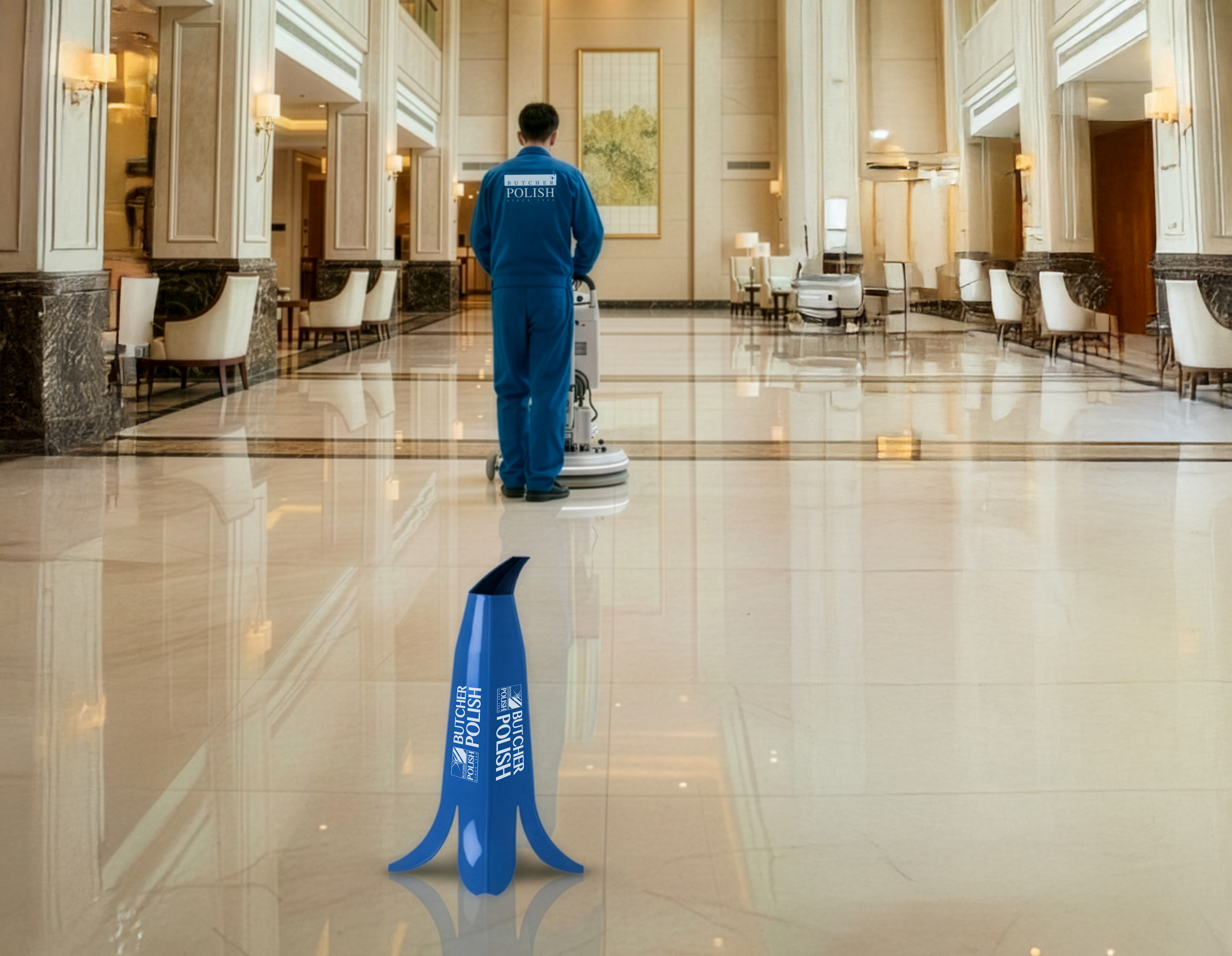
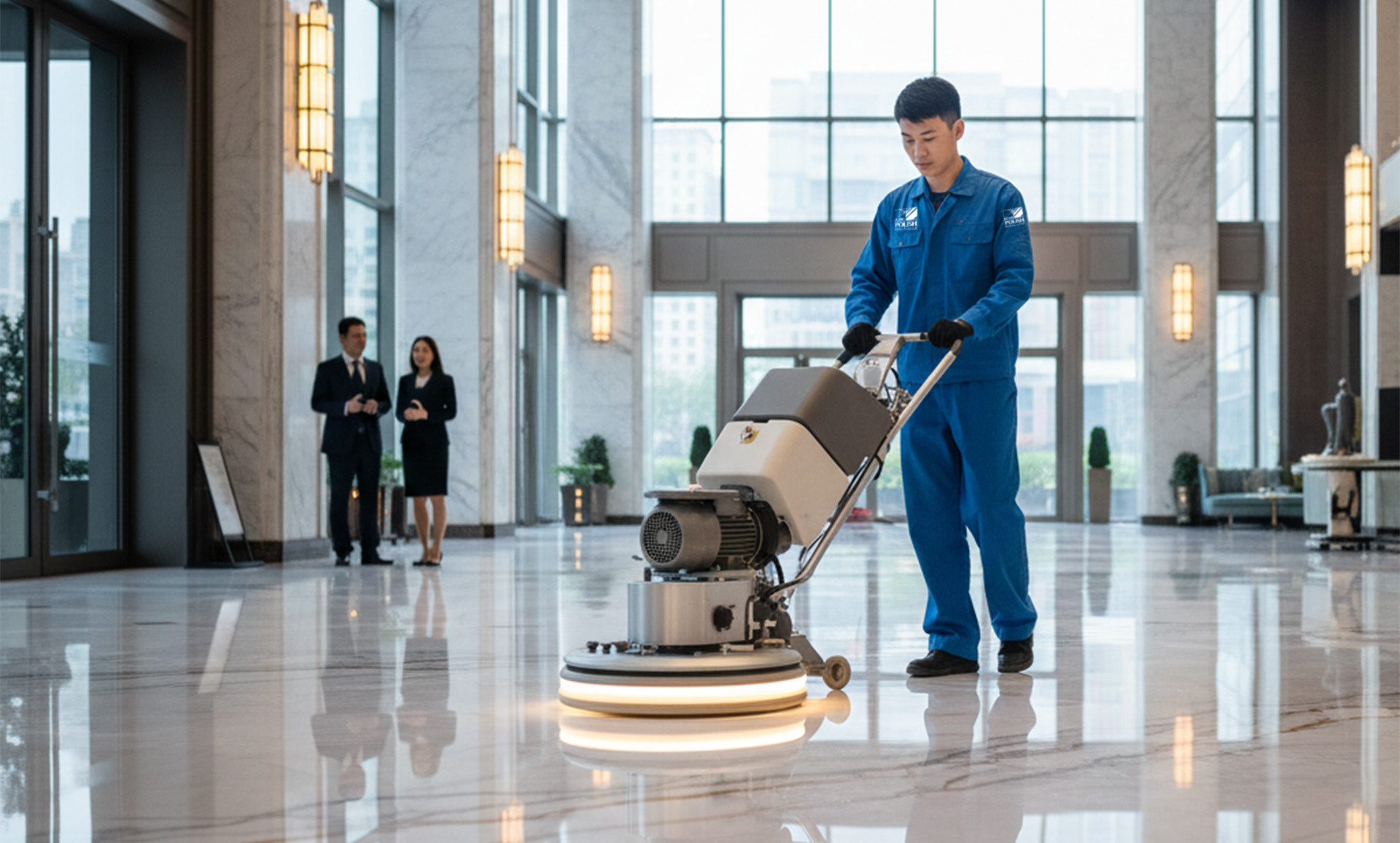
Nicole Leong is a 38-year-old Director of Rooms and Operations for a 5-Star Luxury Hotel in the Marina Bay area.
Motivations:
Nicole is obsessed with the "First Impression." Her primary goal is to ensure that the moment a VIP guest enters the lobby, the marble floors reflect the chandeliers above, reinforcing the hotel's luxury status. She seeks a "phantom service"—a polishing crew that operates invisibly overnight with military precision, leaving no trace of their presence other than impeccable floors. She values expertise in handling exotic materials, needing assurance that her multi-million dollar flooring assets are being treated by specialists.
Pain Points:
Her frustrations stem from mediocrity and disruption. She hates seeing scuff marks or dull patches in the morning light, which she views as a direct reflection of her own competence. She is also deeply annoyed by vendors who leave behind chemical smells that disturb guests, or whose equipment looks dirty and unprofessional when rolled through the service corridors. She fears unskilled labor damaging the delicate natural stone surfaces of the hotel.
Design Implications:
To attract Nicole, the branding must prominently feature the "Gleam" or "Sparkle" element, simplified into a sophisticated, high-end icon. The design language must feel elegant and premium, moving away from "industrial heavy" to "service luxury." The typography should be sleek and modern, suitable for embroidery on high-quality uniforms, signaling that the Butcher Polish crew is an extension of her own 5-star staff.
The Logistical Commander
(Focus: Speed & Capacity)Demographics
(Focus: Speed & Capacity)Demographics
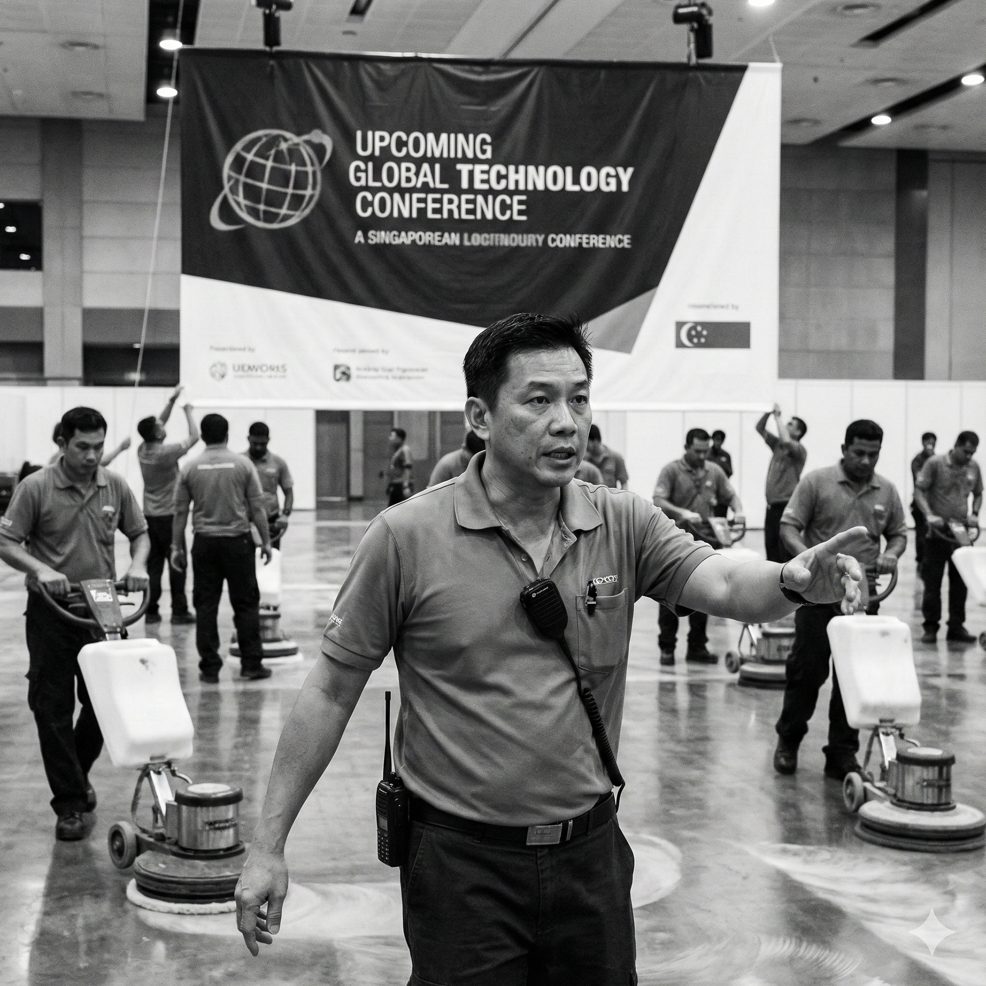
Marcus Lim is a 44-year-old Events & Logistics Manager for a major Singapore Convention & Exhibition Centre.
Motivations:
Marcus operates in a world of extreme deadlines. His primary goal is rapid turnover, he needs a service partner capable of deploying a massive crew to polish 20,000 square feet of ballroom space in the four-hour window between a trade show teardown and a gala dinner setup. He seeks capacity and speed, needing a vendor with industrial-grade machinery and manpower reserves that can be activated on short notice for high-stakes events.
Pain Points:
His nightmare is the bottleneck. He is frustrated by vendors who over-promise and under-deliver on speed, forcing him to delay event setups. He hates having to coordinate multiple small vendors to cover one large hall. He is also stressed by "half-done" jobs where the polish hasn't cured or dried in time for foot traffic, resulting in immediate smudging and a ruined aesthetic for the incoming client.
Design Implications:
To compel Marcus, the branding must communicate Industrial Strength and Efficiency. The logo should feel robust and engineered, utilising bold, strong fonts that are legible from a distance on large machinery. The visual identity should utilise "motion" concepts, perhaps slanting the typography or using dynamic lines, to subliminally signal speed and responsiveness. The overall look must say "We have the manpower and the machines to get it

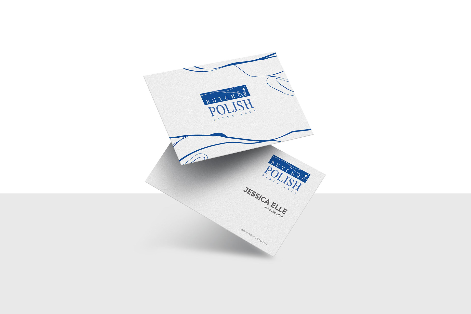
Logo Design Summary
The refreshed Butcher Polish identity transforms a legacy product brand into a premium service leader. It replaces the rigid, dated split-block layout with a unified, modern aesthetic. The design centers on a bold, geometric "Gleam" icon optimized for uniform embroidery and digital interfaces, paired with engineered sans-serif typography. Anchored by a deep "Medical Blue" palette and the "Since 1880" heritage, the logo will convey both institutional trust and high-tech efficiency.