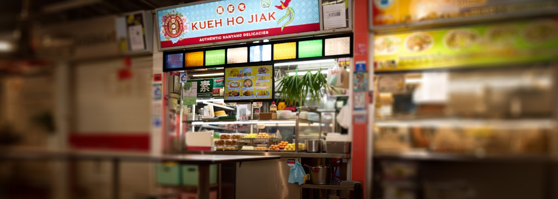
Kueh Ho Jiak
Kueh Ho Jiak is a renowned Singaporean business that specializes in crafting traditional Peranakan (Nyonya) kueh and other Nanyang delicacies. The brand is celebrated for its dedication to heritage, high quality, and innovative approach to traditional snacks.
The Brief/Challenge:
Develop a premium, culturally rich brand identity for a new Nanyang kueh business targeting modern consumers.
Role & Deliverables:
Role:
Lead Graphic Designer.
Lead Graphic Designer.
Deliverables:
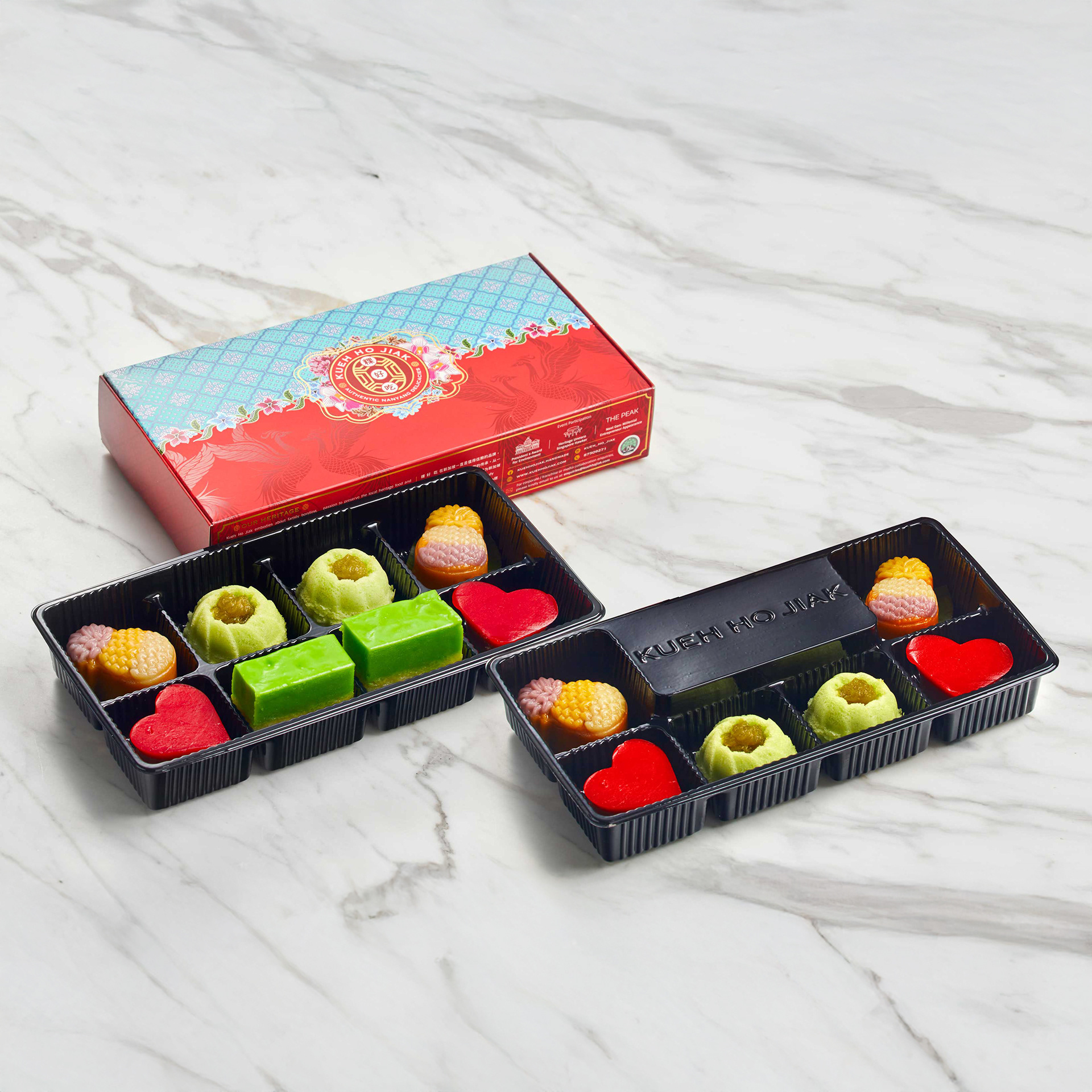
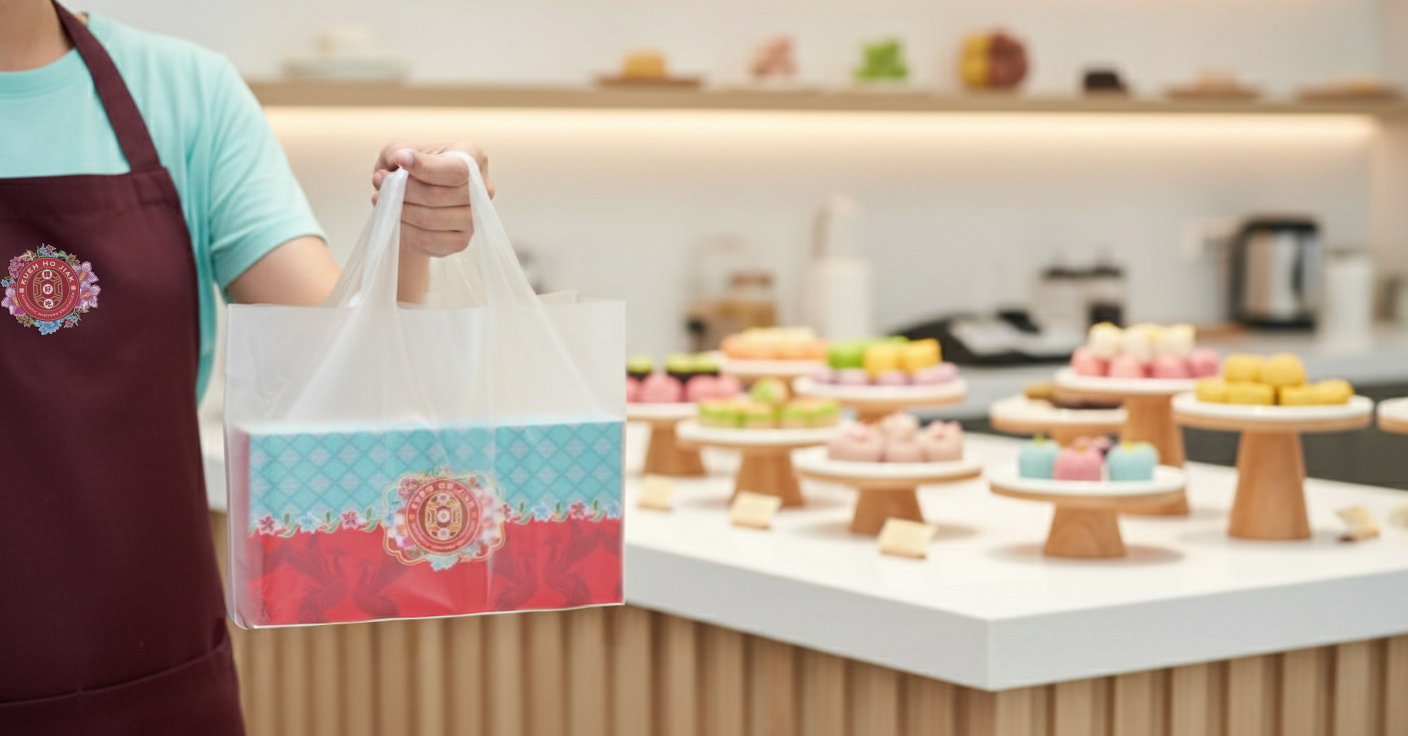
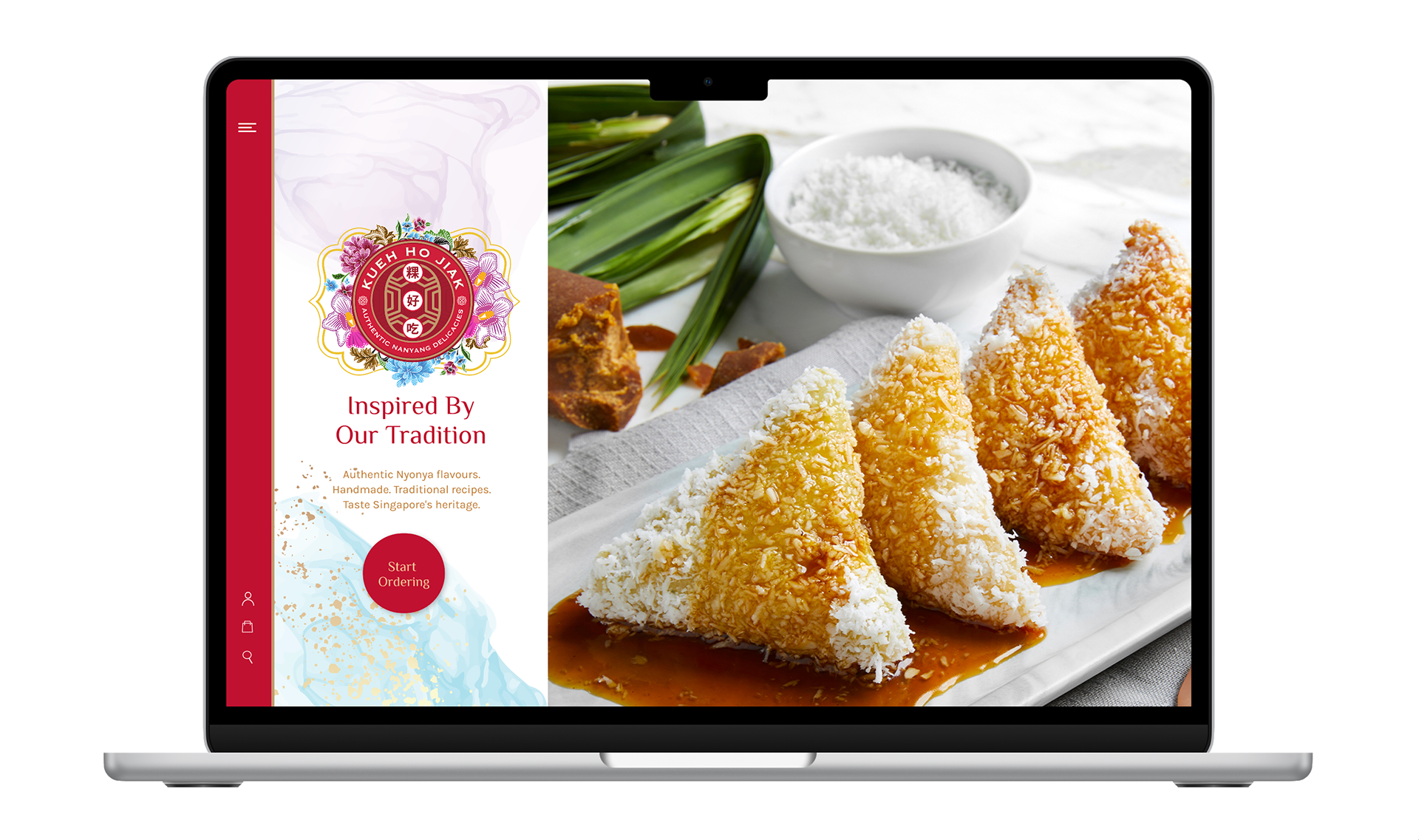
Logo Suite, Color Palette, Typography System, Packaging Design, Digital Mockups.
Project Duration/Year:
4 weeks, 2022
The Target Audience Analysis
The Heritage Enthusiast / Cultural Explorer
This segment values authenticity, story, and tradition. They are the core consumers of Peranakan culture.
Demographics
Generally older millennials and Gen X (35-55), middle to high income.
Motivations
Seeks out authentic, heritage-driven products. Values the story behind the food (Nyonya recipes, traditional techniques). Often looking to support local, artisanal businesses.
Pain Points
Disappointed by mass-produced kueh that lacks flavor or uses artificial ingredients.
Design Implications:
Highly receptive to the traditional Peranakan motifs and rich color palette. The "Authentic Nanyang Delicacies" tagline and the Chinese characters in the logo are key trust signals.

The Modern Gifting & Hostess Market
This segment purchases kueh not just for consumption, but for social occasions, gifts, and hosting.
Demographics
This segment purchases kueh not just for consumption, but for social occasions, gifts, and hosting.
Motivations:
Needs sophisticated, presentable packaging for corporate gifts, festive occasions (e.g., Chinese New Year, Hari Raya), or unique party favors. Values convenience and presentation equally.
Pain Points:
Current traditional packaging often looks cheap or messy. Needs a premium unboxing experience.
Design Implications:
Requires clean, structured packaging design mockups. The logo must look elegant when rendered in single-color gold foil stamping or as a seal. The website UI/UX must be simple for bulk orders.
The Young Foodie / Connoisseur
This segment is driven by trend, aesthetic, and culinary quality, often discovering the brand through social media.
Demographics
Young Millennials and Gen Z, highly active on Instagram & TikTok.
Motivations:
Seeks new, photogenic, and high-quality food experiences. Enjoys sharing beautiful aesthetics and "discovering" hidden gems. They view food as a status symbol.
Pain Points:
Traditional food can sometimes feel outdated or inaccessible.
Design Implications:
The brand needs a strong visual identity that translates well to a square grid. Requires high-contrast, stylized photography and clean social media templates that integrate the vibrant colours and patterns in a contemporary way. The clean typography helps modernize the traditional crest.

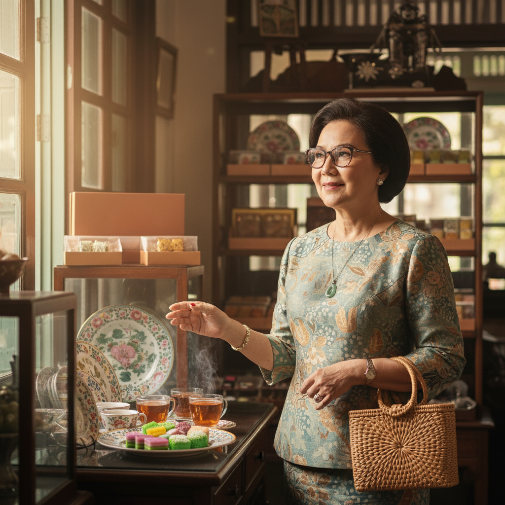
A Peranakan - Inspired Visual Direction
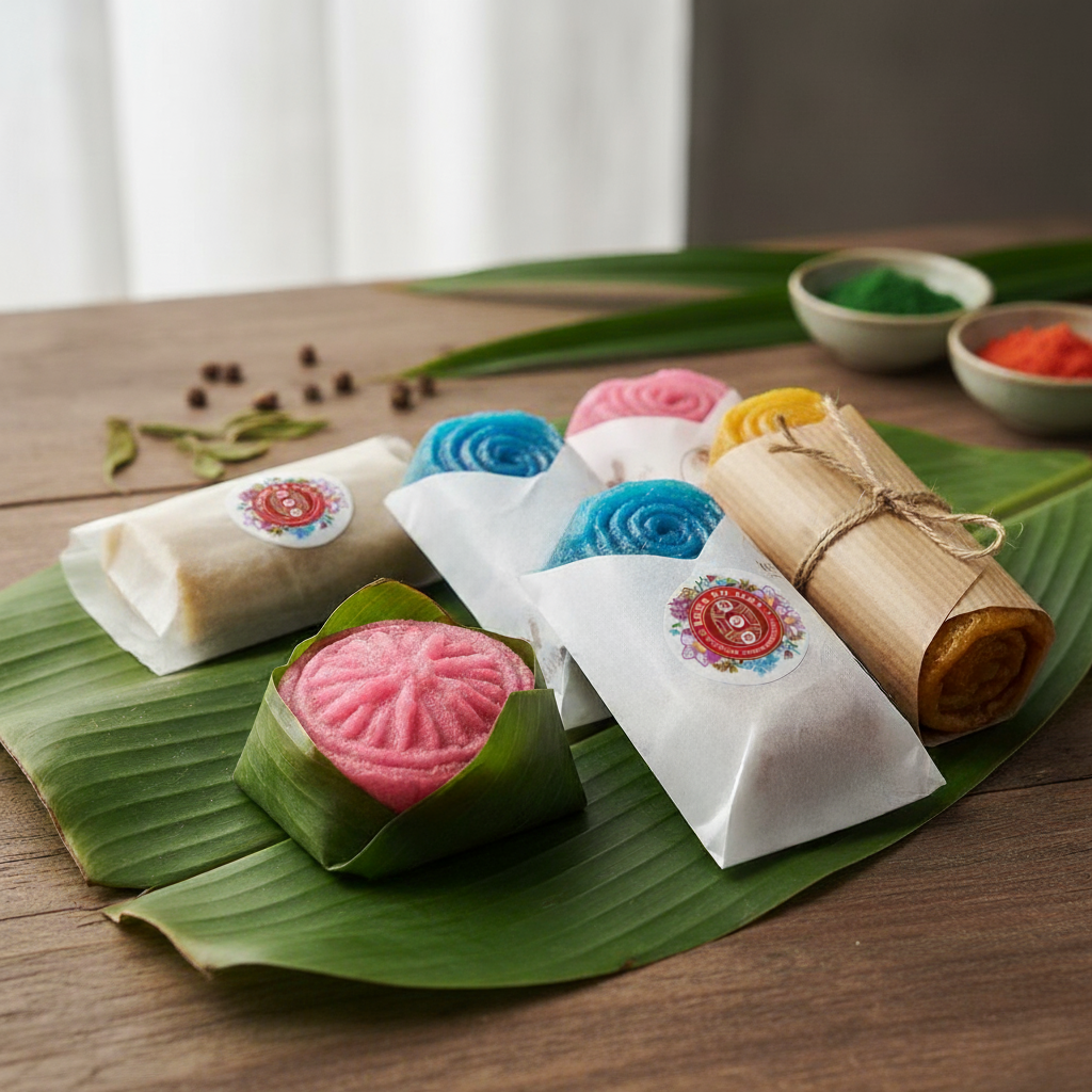
The moodboard expresses a richly layered Peranakan aesthetic, drawing from traditional motifs, heritage textiles, and architectural ornamentation. The direction communicates a brand world that is vibrant, cultural, and intricately crafted that is perfectly aligned with a kueh shop that celebrates authenticity and artistry.
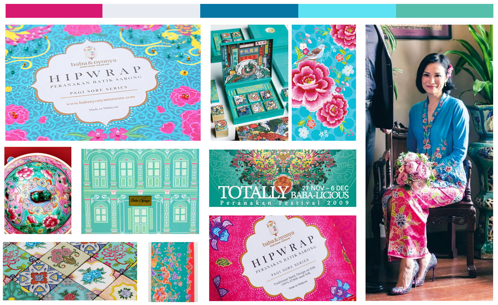
Kueh Ho Jiak’s visual identity blends Peranakan opulence with modern vibrancy. Through a palette of jewel-toned florals, heritage patterns, and architectural cues, the brand celebrates the meticulous craftsmanship of traditional kuehs while presenting them in a fresh, contemporary lens. The design immerses customers in a world of colour, culture, and heartfelt nostalgia—every detail crafted to honour the flavours and stories passed down through generations.
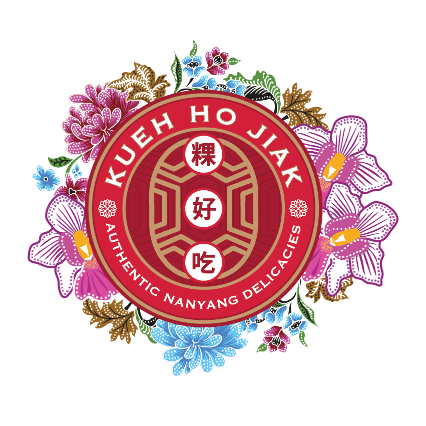
Logo Design Summary
The Kueh Ho Jiak logo is an expertly crafted cultural crest. It succeeds by marrying tradition and modernity. It uses traditional Peranakan color palettes and motifs but applies them within a clean, circular, and organised modern badge structure.
The gold accents and the dense detailing elevate the perception of the product from casual food to an artisanal, high-quality delicacy.
The logo immediately tells the story of the brand's heritage, region (Nanyang/Southeast Asia), and core product (kueh).